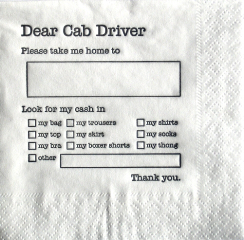
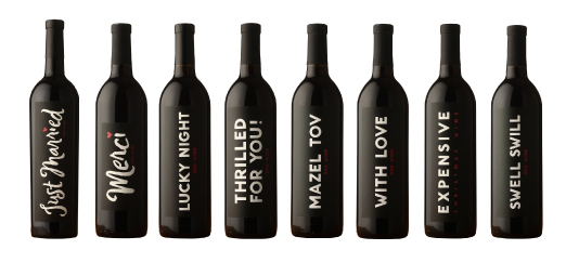
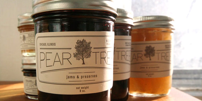
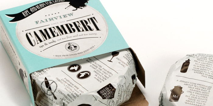
Drink responsibly.
spotted on Chinatown Monday
Leave your mark – paper pleasantries + more
Perfect for a wedding celebration or any special occasion Swanson Vineyards has created wine bottles that do the talking for you…
Picking your perfect message with a sleek design = happy toasts!
spotted on snippet & ink, swansonvineyards.com
Chicago jam makers called Pear Tree Preserves picked the pear-fect label for their organic and locally produced jams & preserves. A combination of letter-press, illustration and clean font and lines embrace the handmade art of the label designed and letter-pressed by Susie Kirkwood and give homage to the hands that perfected the fruit preserves.
Fairview Cheese wanted a redesign of packaging that broadened their consumer base and brought down packaging costs in a money cautious market. The design agency, Coley Porter Bell, not only succeeded in delivering a great looking design that saved 8% of production costs but in one year following the re-launch with the new design, without any price reduction, value sales rose by 31.9% and 32.4%, exceeding the growth target of 25%. Now that’s impressive!
spotted on and statistics from the dieline
David Mikush, a student at Creative Circus in Atlanta, created the below Burt & Bumble handmade honey products and packaging as an extension of Burt’s Bees line of earth-conscious, natural beeswax products. He and another designer, Samantha Schneider wanted to capture the right aesthetic for new products of the environmentally responsible brand. The designers chose beautiful bottles and jars with copper tops and I adore the wood box containing an assortment of honey, even the handle looks like the honey dipper. The finished result – super sweet!
spotted on thedieline.com
Copyright © Impressed Inc 2017